Watching The 400 Blows kept making me think about Raging Bull. Which makes sense; I had watched the Scorsese film a week before, I had been told that Raging Bull was stylistically inspired by the French New Wave, and both films were deliberately shot in black and white.
Raging Bull seemed to pop, despite the grayscale aesthetic. The boxing scenes in particular made incredible usage of shadows and contrast. These lent a greater sense of dramatic weight, taking the personal story of LaMotta and creating a universal conflict out of it.
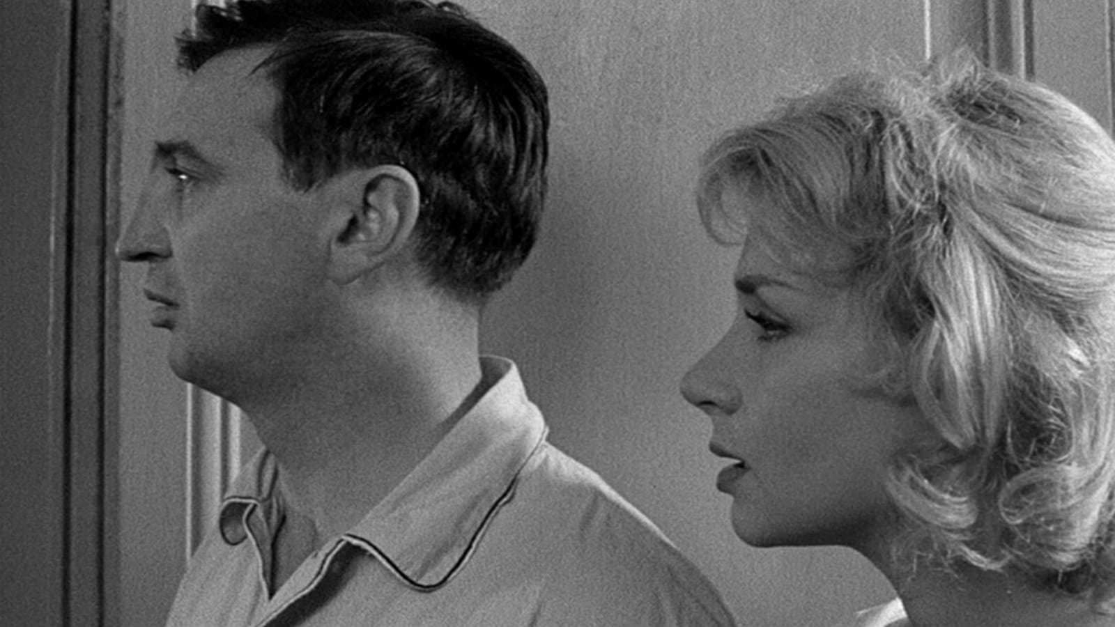
The aesthetic of The 400 Blows was very different. Here, the color palette was very drab. I suppose there are a few practical reasons for this. For one, Truffaut's film was shot on location, giving less room for the manipulation of lighting, etc. But thematically, the film (and the French New Wave in general) is an argument for the 'poetry of the everyday' and finding beauty in the mundane. The use of grayscale certainly contributes to this effect.
A shot that particularly struck me depicted Antoine's parents in their apartment. Their faces seemed to almost dissolve into the grey walls around them. As characters, they are defined by their aloof relationship with their son. The shot and its color seemed to reinforce that idea.
So, both Raging Bull and The 400 Blows used the same color palette to startlingly different effects, and for very different philosophies.
I find it interesting how you compare the two films. They are both shot in black and white but the characters are both rebels. I think the only difference is that Jake LaMotta is older and knows more while Antoine Doinel doesn't know much yet. The problematic character of LaMotta is met with commentary much more harshly than Doinel because he is just a child. Yes, his actions are not as aggressive as Antoine's but it's something to think about.
ReplyDeleteWhile both films are in black and white, I agree that they have very different aesthetics. In Raging Bull everything seems to really stand out, accentuated. In The 400 Blows on the other hand, it feels very grey and dreary. It's so interesting how the two films use the same sort of color palette, but in such contrasting ways. I love the shot you show of Antoine's parents, they practically blend into the wall behind them!
ReplyDeleteI like your description of the shot pictured. I noticed that the interior shots were mostly grey, and the scenes with Antoine out in Paris emphasized more light/dark, which I think looks a lot better.
ReplyDeleteI think your observations and the observations of those who commented here really demonstrate the dynamic nature of black and white film. I think that your comparison between these films is really rich because they are such different films yet they utilize many similar techniques.
ReplyDelete